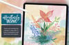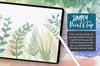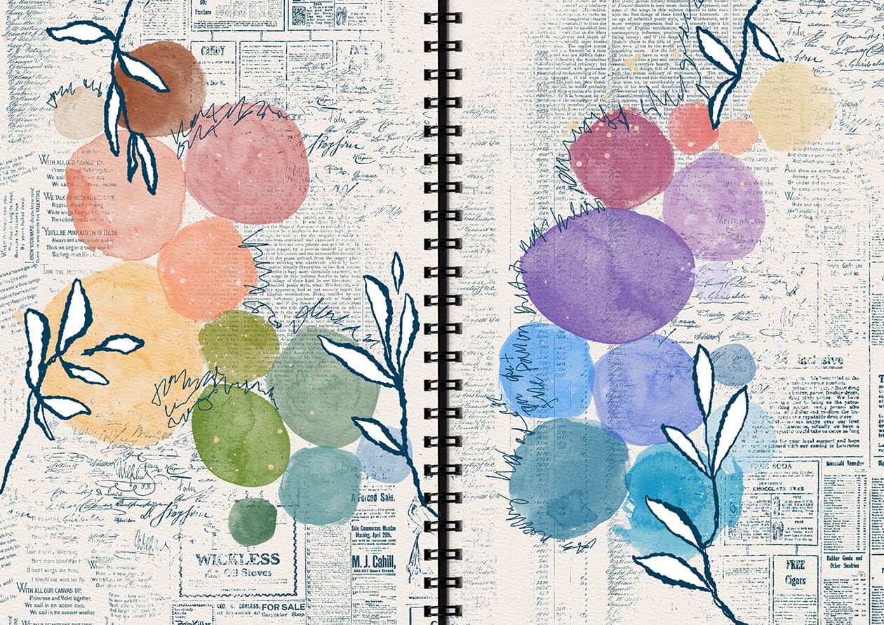
Today I wanted to share a quick little inspiration video. It starts with a rainbow of watercolor circles, juxtaposed against dark vintage text patterns, and finished off with inky florals and lettering. I love throwing a few different ideas together like this and seeing how they play off each other.
It's a beginner friendly project and a great way to practice building a color story without worrying about making anything perfect. You're very welcome to journal along with me, whether you use my exact supplies or something completely different.
Canvas Setup
- Base: Free Procreate Journal Template (landscape version)
- Template settings: Spiral binding on, watercolor paper texture on
- Brush Sets Used:
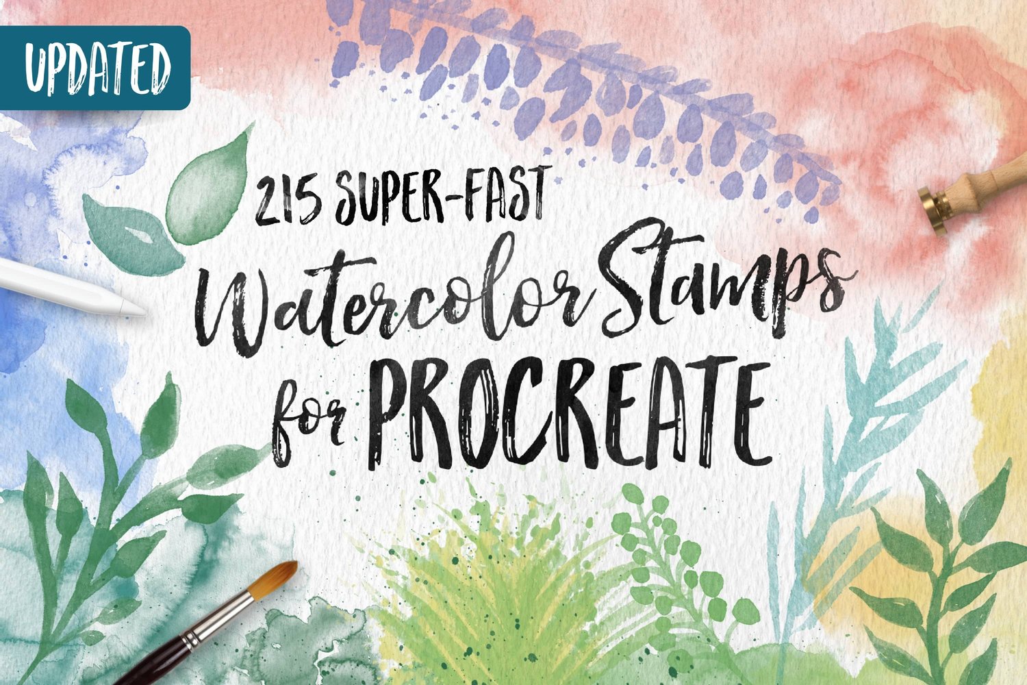
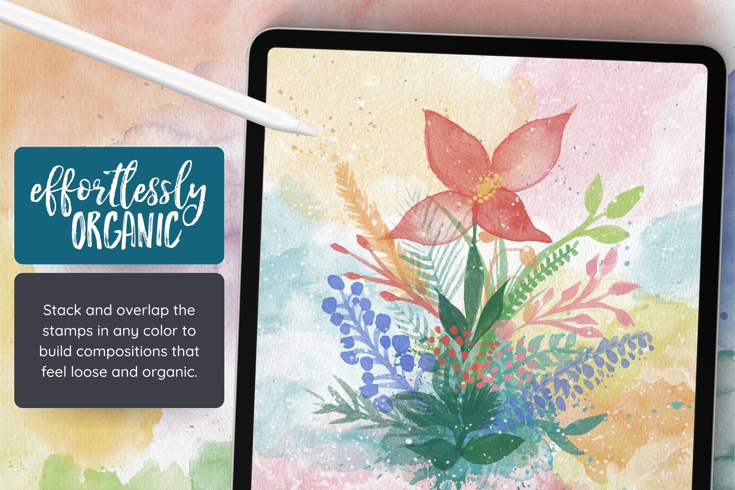
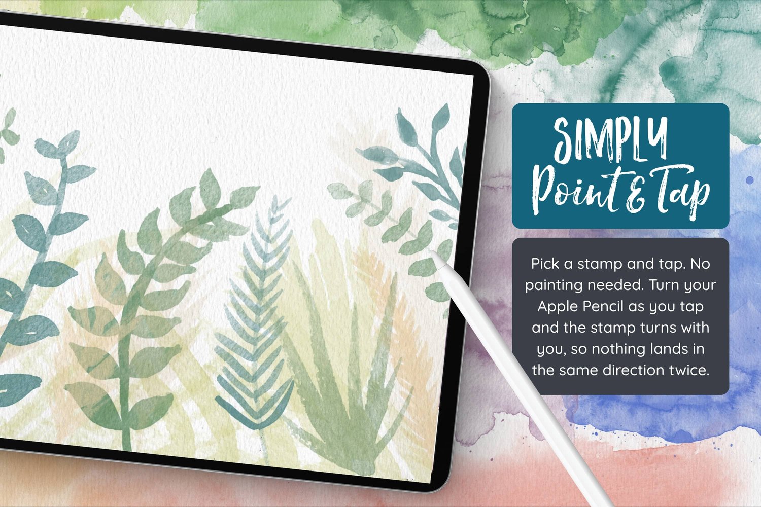
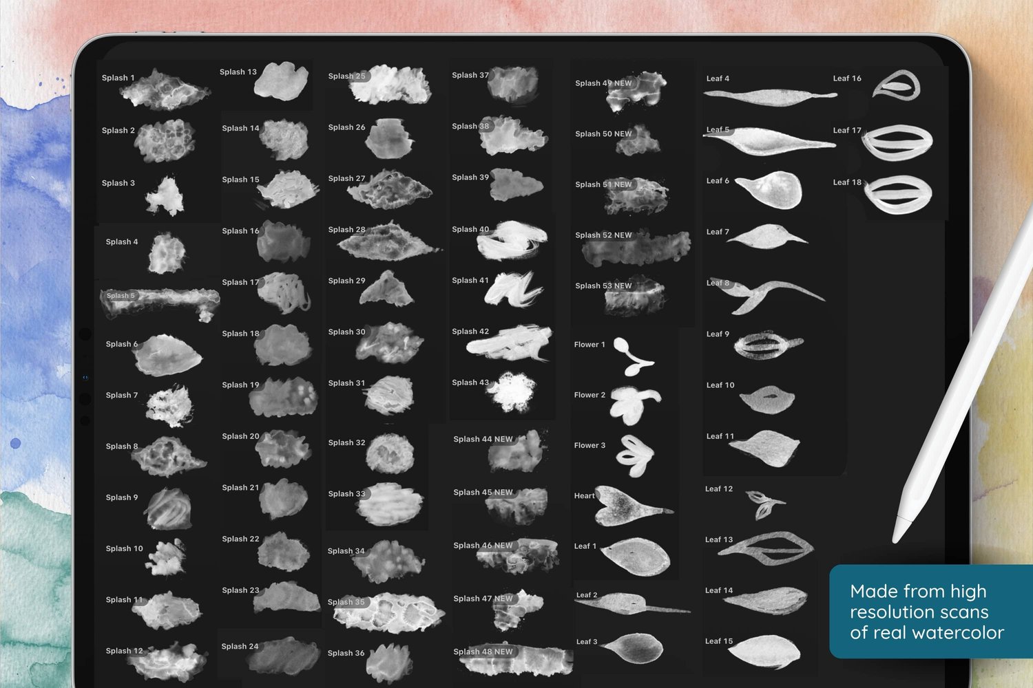
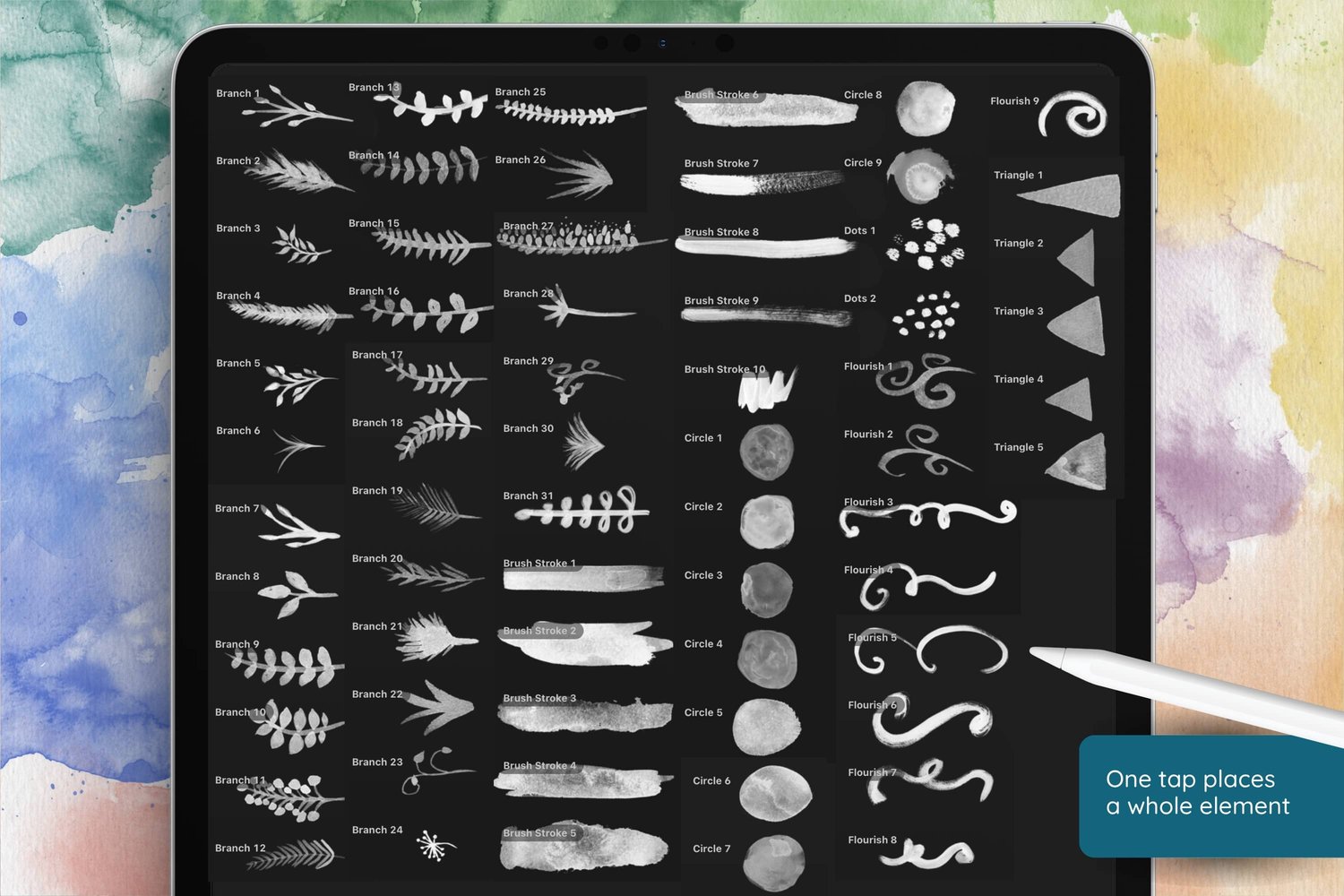
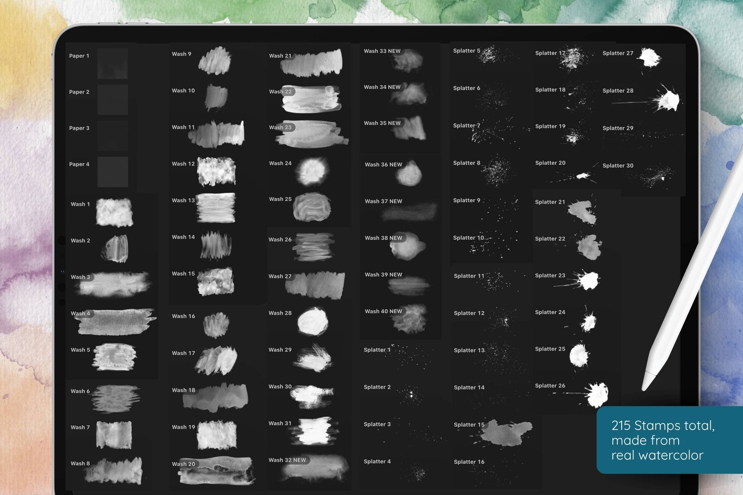
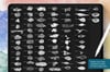
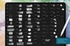
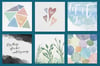
- Watercolor Stamps for circles and splatters
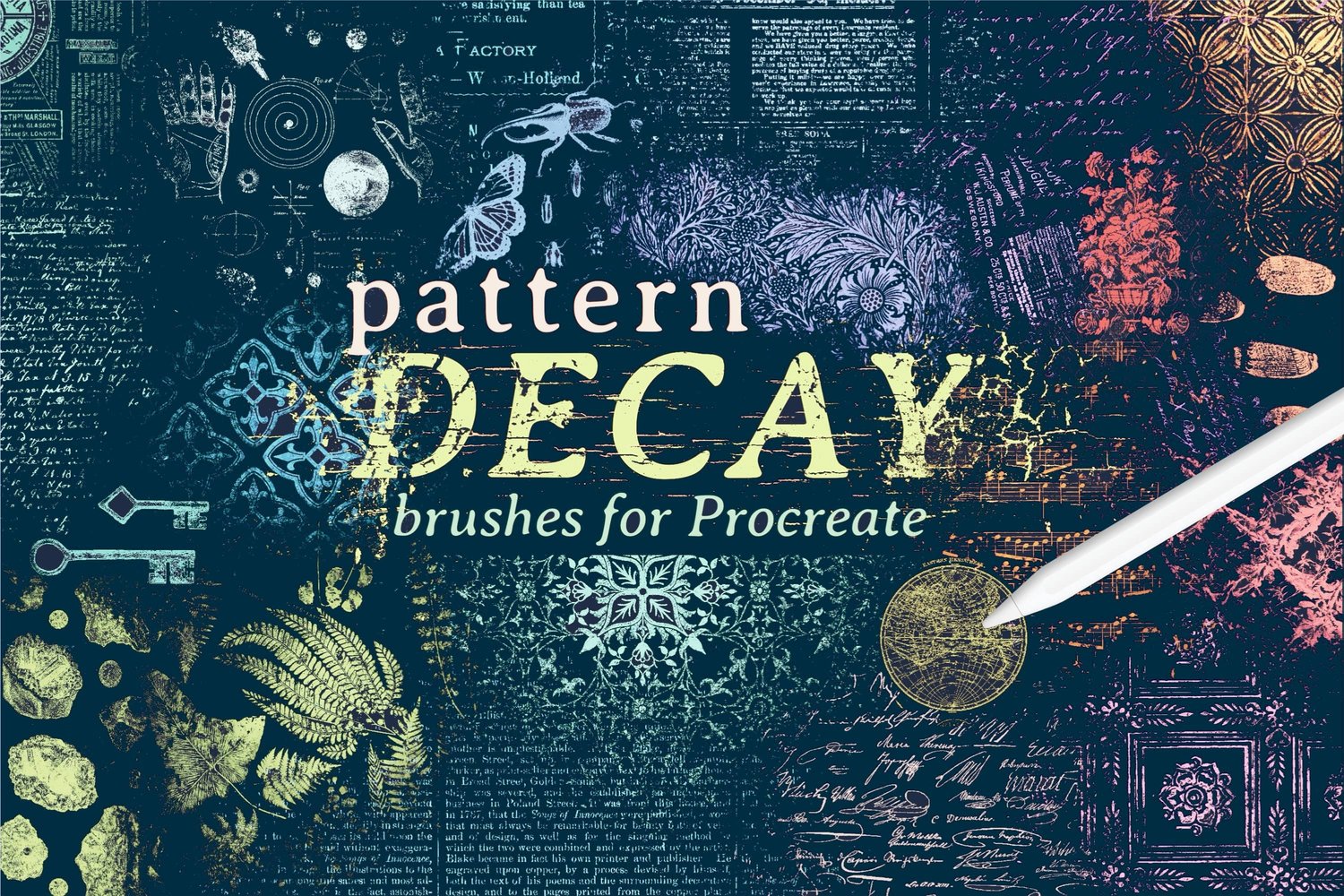
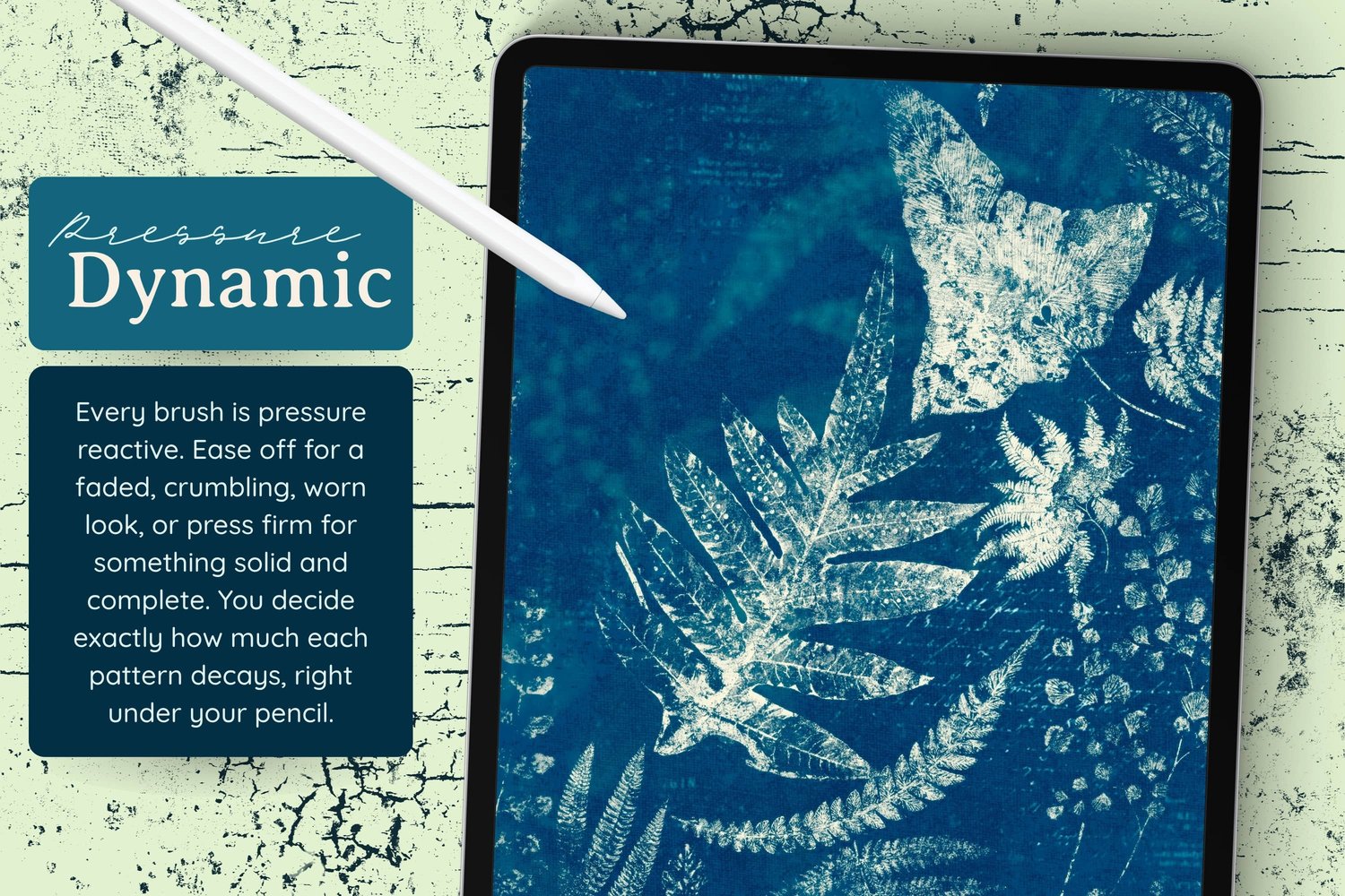
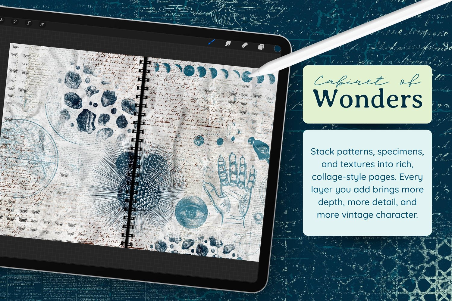
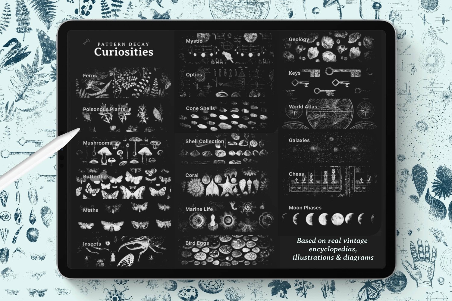
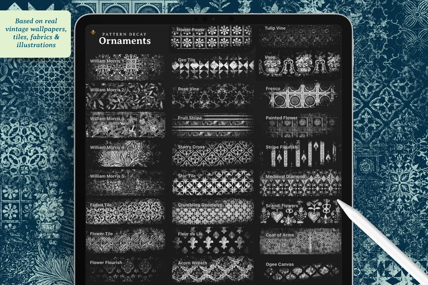
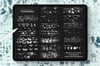
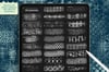
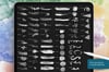
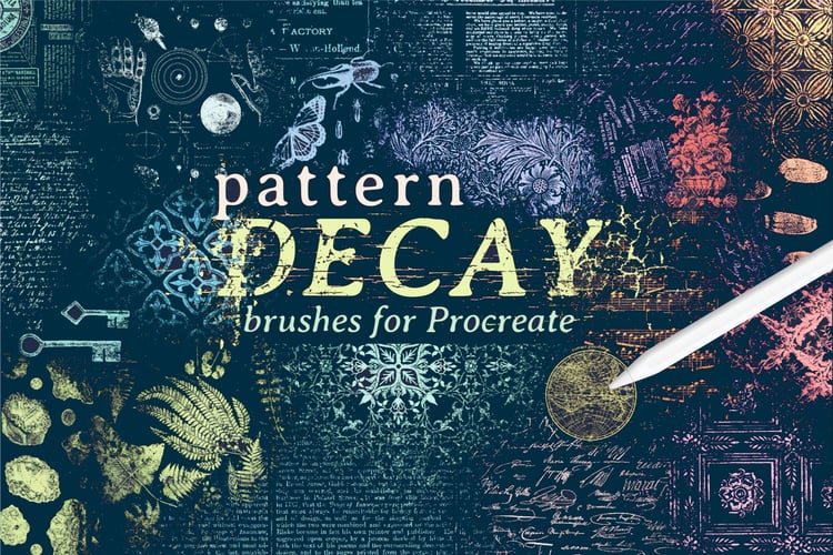
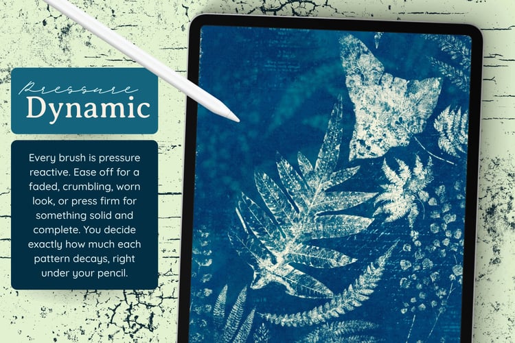
- Pattern Decay for the text background
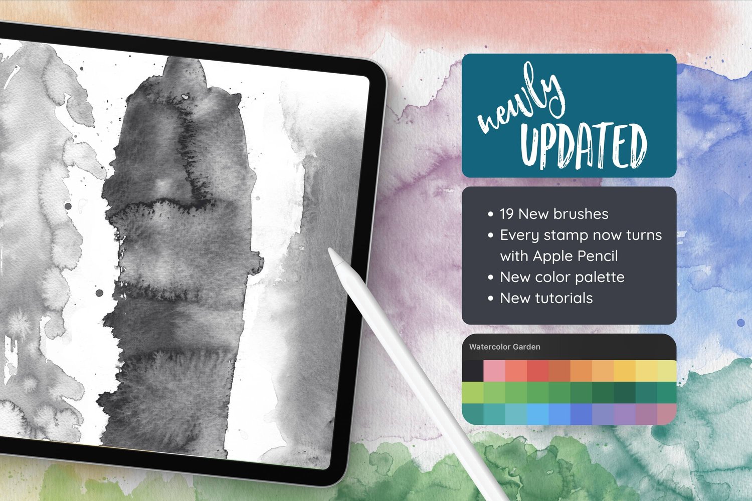
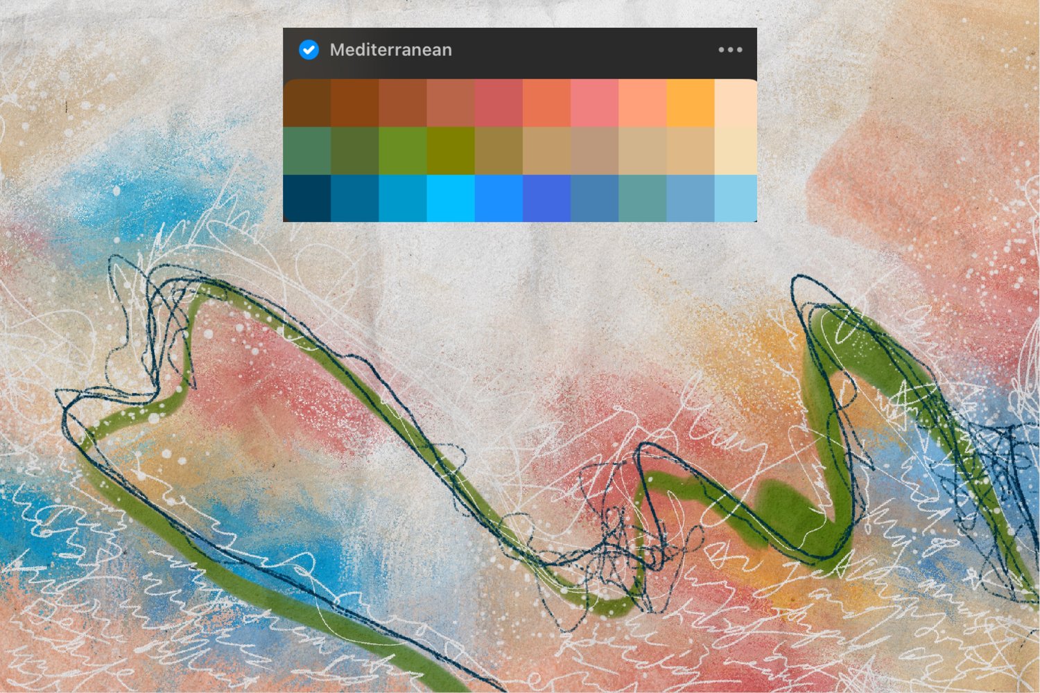
- Color Palette: Mediterranean
Step 1: Stamp Your Watercolor Circles
In the "draw here" layer, start laying down watercolor circle stamps on both sides of the page. These stamps tilt with your pen, so experiment with the angle to get different effects.
A few tips:
- Put each stamp on its own layer so you can rearrange them later
- Try moving through your palette in a rainbowy direction for a natural color flow
- If your palette doesn't have quite the color you need (mine has no purple), pick a nearby color and adjust it on the value tab, shifting the hue and saturation
- Don't love a color? Lower the layer opacity or nudge the hue rather than starting over
Keep rearranging until the composition feels right, and let the circles tell you where they want to go.
Step 2: Add Splatters
Before leaving the Watercolor Stamps set, add a new layer on top of everything and stamp in some splatters. Keep the colors neutral and light so they add texture without competing with your circles.
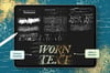
Step 3: Build the Text Pattern Background
Group all your circle layers together (keep them separate inside the group in case you want to adjust later), then add a new layer below the group.
Switch to the Pattern Decay brush set and choose a dark color. I used the really dark blue from the Mediterranean palette.
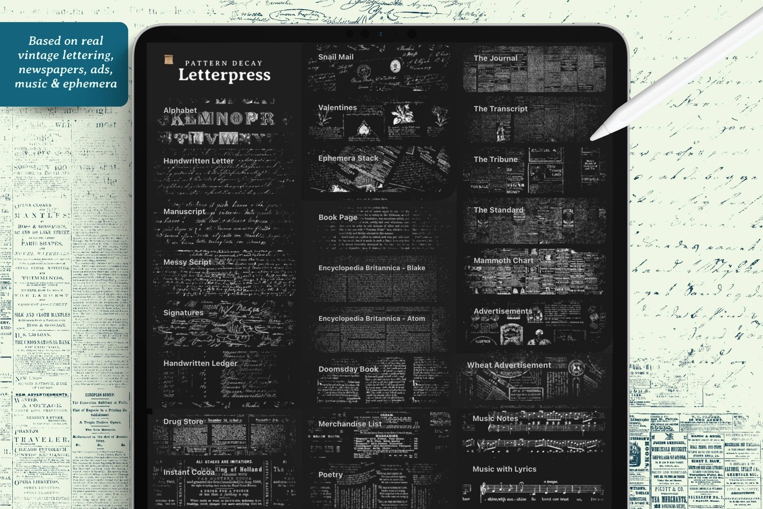
Brushes Used (Pattern Decay, letterpress section):
- Drugstore – old-timey drugstore and candy ads
- The Tribune – newspaper text
- Encyclopedia Britannica
- Handwritten Ledger – lovely running up the sides
- Signatures – great for filling small gaps
- Poetry – old-timey poems
Keep the color consistent across all the text patterns, make them fairly small, and let them overlap. The goal is a grungy, layered background that contrasts with the bright circles.
Step 4: Doodle Some Florals
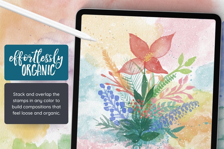
Add a new layer above everything. Using an inky pen (I used Night Jar from the Procreate library, but the Ink Blot or Toothy Fine Liner from my Mixed Media set work beautifully too), doodle some loose leaves and florals coming in from the sides.
Keep it really doodly and let your hand be random with the pressure so the lines come out blotchy. That imperfection is what gives it character.
To fill the leaves, double tap next to white in your colors, then use color drop to drag white into each leaf. If the color floods the whole page, your leaf outline isn't fully closed, so just undo and doodle the gap shut.
Step 5: Final Lettering
Go back to your dark blue and the same inky brush, make it small, and add a little lettering around the shapes to finish the page.
More Ideas
- Try a completely different palette and see how it changes the mood
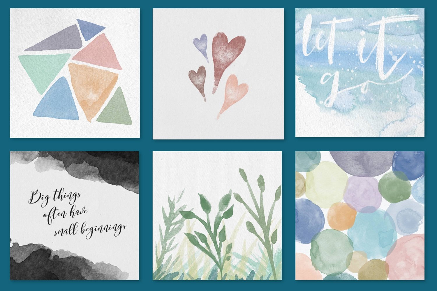
- Swap the circles for other watercolor shapes
- Draw shapes with other brushes instead
- Experiment with color dropping white across larger areas (my accidental full page drop was actually an interesting effect worth exploring)
- If you don't have the Pattern Decay brushes, do your own lettering across the entire background instead
- Or, fill the background with Ephemera scraps
- Use any inky pen you have on hand for the doodles