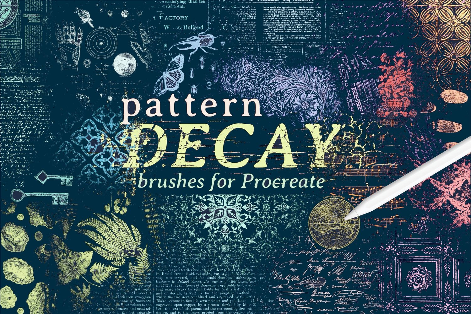
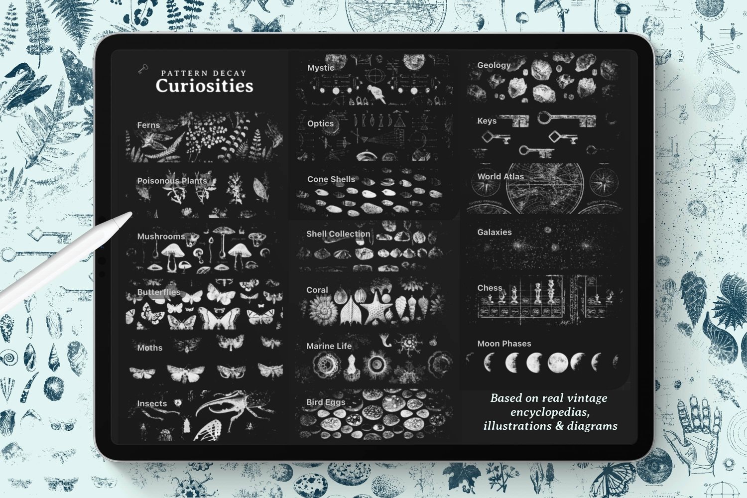
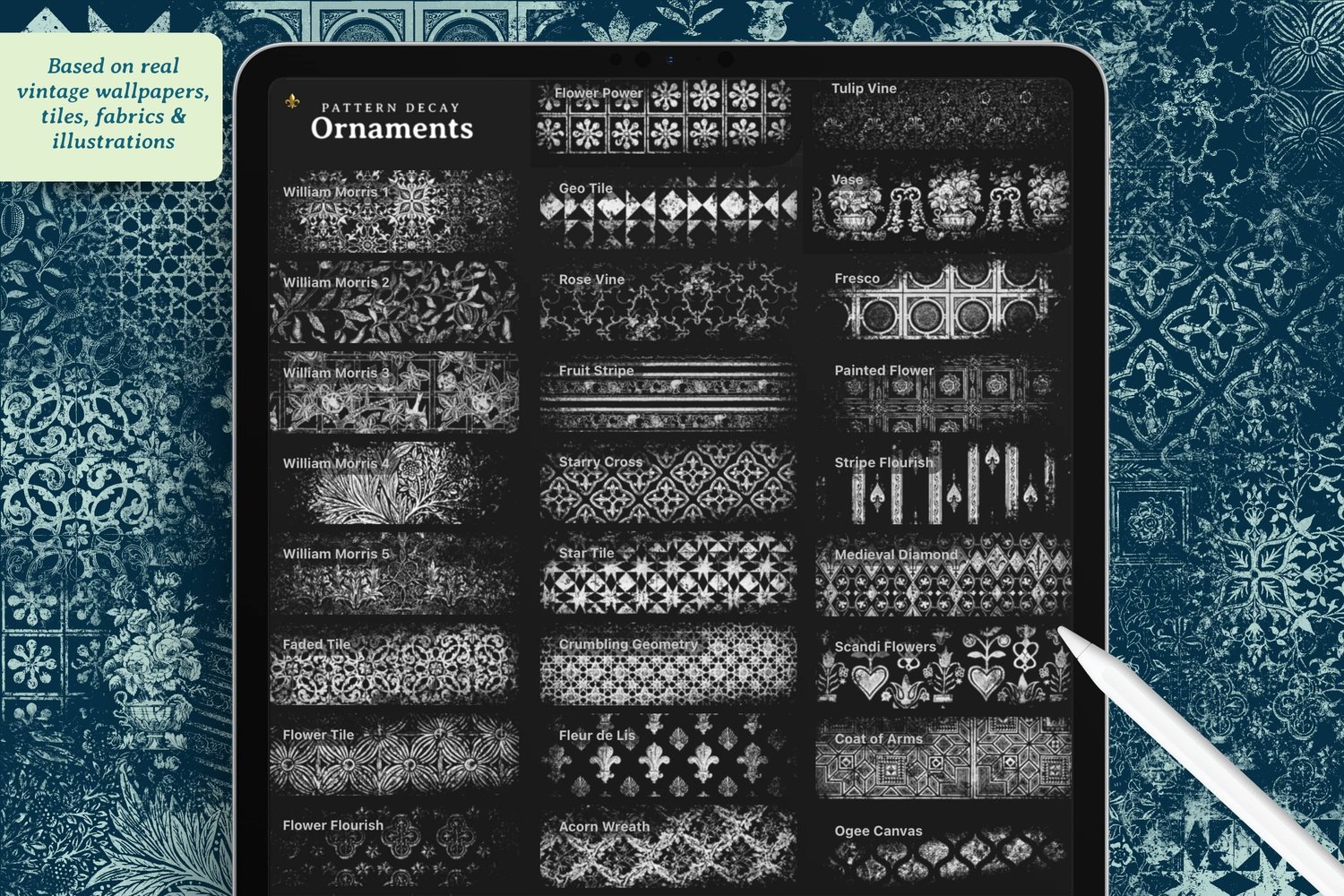
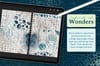
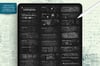
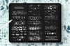
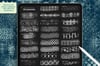
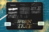
While working on the title image for my new Pattern Decay brush set, I developed a process for distressing the title text that I wanted to share in this tutorial. We'll add a font, then break it up with texture brushes using a layer mask, which means the text stays fully editable the whole way through. You can go back and change the word, the font, or the color at any point and the distressing stays put. At the end we'll add some worn metallic effects too, because I couldn't resist.
Canvas Setup
- Size: Screen size
- Brush Set Used: Pattern Decay, specifically the texture brushes
- Color Palette: Letterpress (comes with Pattern Decay)
- Font: IM Fell (free from Google Fonts)
Step 1: Install the Font
IM Fell is an old English font based on type from the 1600s, and it won't already be on your iPad. Here's how to get it, and it's kind of just like installing brushes really.
- On the Google Fonts page, tap Get Font, then Download All
- Tap the little arrow in Safari to see the download
- Tap the file to open it in your Files app, and tap it there to unzip it
- Inside the new folder you'll find two TTF files, the regular and the italic
- Select both, hit the share button, and choose Procreate
You'll see a little check mark, and that's it, the font is in.
While you're on Google Fonts, have a look around. There are some other good ones for this sort of thing, and anything vintage or rugged will distress nicely.
Step 2: Add Your Text
Tap the gear icon, then Add, then Add Text.
It comes through in a generic font to start with, which is fine. I type my word out first and change the font after. I went with all caps and kept it simple.
Then select all of it and switch over to IM Fell. There's a regular and an italic, and I am loving the italic, so that's what I went with.
Make it a lot bigger. You'll probably find the text box isn't big enough to hold the whole word, so stretch the box out first and then size the text up as much as you want.
I brought the leading down (that's the space between the lines) until the letters were almost lining up with each other, and messed with the kerning a bit to bring things closer together. Honestly I just keep fiddling with these settings until I'm happy with how it looks.
To center it, turn on the move tool, choose uniform, and turn snapping on. When you see both yellow lines at once, you're in the center.
I started in black and then decided I wanted a rusty brown red instead. You can still tap the text layer and change the color or the words at any point, as long as you're on the right layer.
Step 3: Distress the Text with a Layer Mask
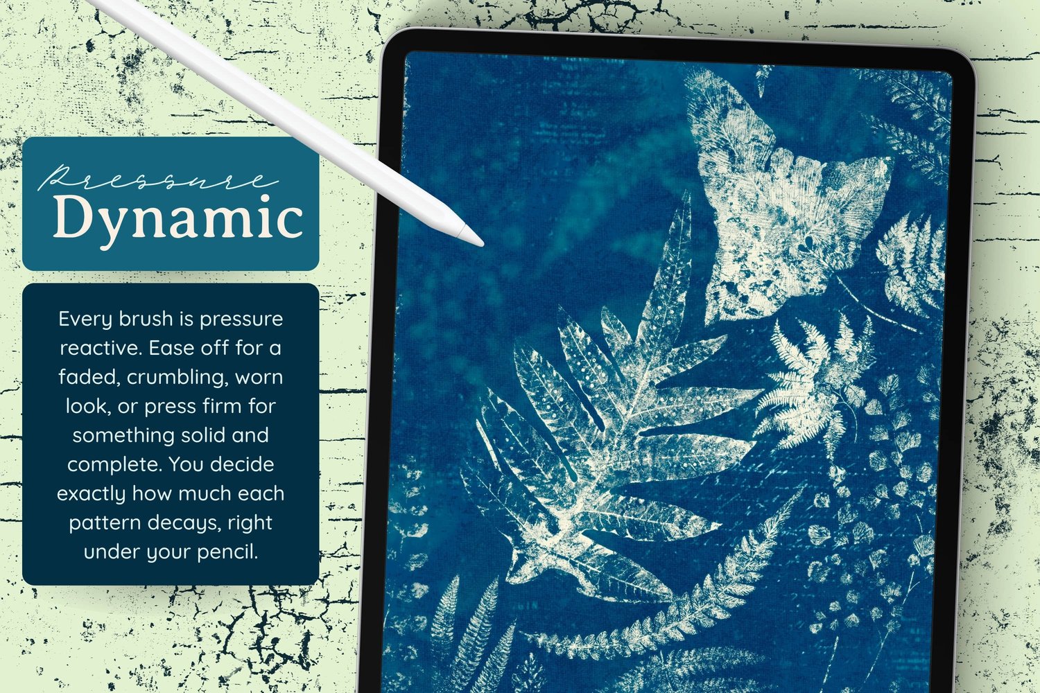
Here's the part that keeps everything editable. We don't have to rasterize the text to erase bits of it. We can use a mask instead.
Tap the text layer and choose Mask.
This is a layer mask, not a clipping mask. A layer mask works so that white reveals and black covers up, so to erase parts of the text we need pure black, which is already selected for you once you're in the mask. If you tap the checkmark on the layer to turn it off, you'll see your red come back. Anything you paint while you're in the mask will be white, black, or something in between, because that's just how layer masks work.
Now grab a grungy texture brush and paint over the letters.
Brushes Used (Pattern Decay set):
- Cracks
- Big Cracks
- Peeling Concrete
- Flakes
What I like to do is not use the same brush across everything, but use a few different ones and focus each in specific areas.
You can check your work by turning the mask off. Everything is still there underneath, and the text is still editable.
Step 4: Add Texture Around the Text
This is what I did on the cover of the Pattern Decay set, and it's a slightly different thing, so I wanted to show you that too.
- Add a new layer above the text
- Use the same color as the text so it all looks like part of the same thing
- Use the same texture brushes, but this time on the outside of the letters
I stayed in roughly the same areas I'd already worked on, so the wear looks like it's spreading out from the text rather than floating randomly. Most of the texture went in one area on each side to keep some balance.
You could put each brush on its own layer if you want more control, but I kept it all on one for simplicity.
Step 5: Make It Metallic
We can take it further by adding a color that isn't the same as everything else. Metallics work nicely here.
Add a new layer directly above the text layer and tap Clipping Mask. Whatever you paint on this layer will only show up on the text below.
Brushes Used (Pattern Decay set):
- Metalwork and Metalwork Flakes
Pick a warm brown and it comes out looking like gold. I let it cover some of the letters and left others alone, so the red still peeks through underneath.
To get the same metallic effect on the texture around the outside, duplicate that clipping mask layer, move the copy above your outer texture layer, and tap Clipping Mask again.
A quick note on why we do it that way: Procreate doesn't (yet) allow clipping masks on whole groups. In Photoshop you'd just group everything and clip once, but here we duplicate instead. So we've got two different kinds of masks going at the same time, which sounds like a lot, but I promise you it's not that complicated. And it's all still nondestructive.
Optional Adjustments
- Try a different font. Vintage and rugged styles distress really well
- Use any grungy texture brushes you already have, including the grunge brushes in the standard Procreate library
- Add more clipping mask layers in different colors for a patchier, multi-tone look
- Try it on hand lettering instead of a font
Project Ideas
- Try using this technique to make yourself a logo or watermark
- Design printables with written messages like greeting cards, quotes or posters
- Design a digital journal cover by using the portrait version of my free template